pyPheWAS Explorer Walkthrough
On launch, the Explorer loads all data and performs some preprocessing steps. The first time it is launched on a new dataset, it must build binary, count, and duration feature matrices as described in pyPhewasLookup. These feature matrices are saved in the working directory so they may be re-loaded for faster startup on subsequent launches.
The Explorer is made up of two primary panels: the Regression Builder panel and the Regression Evaluation panel. Descriptions for both are below.
Regression Builder Panel
The Regression Builder panel provides three important functions for the user:
- examine compact summaries of individual group variables;
- consider the joint distribution and statistical relationship of two group variables;
- design and run PheDAS models.
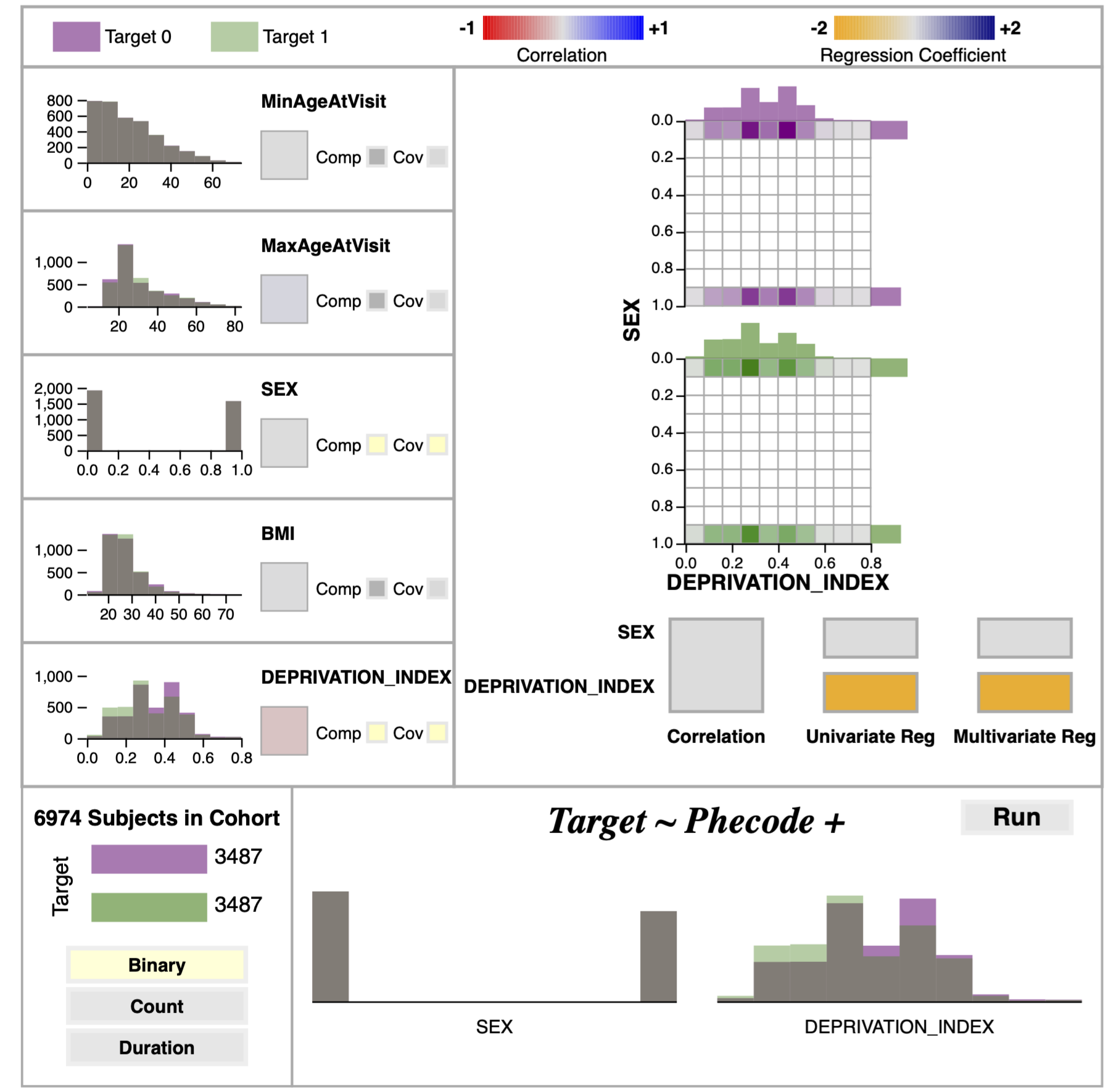
Individual Variable Summaries
In the individual variable views, the distribution of each variable for both the disease group and the control group is shown via overlapping histograms. Bin size was constrained to be identical between the two groups to make comparison easier. Additionally, the bins were made to be partially transparent to prevent overlapping bins from obscuring the distributions. To complement this view, the individual variable section also includes a colored block which denotes the correlation coefficient between the group variable and the target disease via its face color. Together, the distributions and correlation coefficients are intended to give the user a good first impression of all variables.
Variable Comparison View
The variable comparison view (VCV) is activated by selecting two variables via the “Comp” button in the individual variables’ summary blocks. The VCV features two types of comparison: joint distributions and statistical comparison. Two joint histograms are shown for the selected variables, one for the disease group and one for the control. Bins with no members are colored white, while bins with at least one member are colored on a scale from gray to the group’s color (green for disease, purple for control) according to the number of members in the bin. This coloring emphasizes where members are located in the distribution, immediately drawing the user’s eye to the non-empty bins. To support more precise examination, hovering over the bins displays their membership count at the upper right of the histogram.
The VCV’s statistical comparison section shows summary statistics as colored blocks below the joint histograms. The first of these is the correlation coefficient between the variabless. The second is a multicollinearity test, wherein the target variable is regressed as a function of each variable individually and by both variables together. The coefficients calculated from these regressions are then displayed as colored blocks for each variable. In general, if the two variables are not correlated and their regression coefficients remain constant across the individual and combined multicollinearity models, the independence assumption holds, and they may be safely included in the PheDAS model together.
Model Designer
The regression builder view contains two sections. The first section displays the target variable split in the cohort and the selected regression type (Binary, Count, or Duration). Users can switch between regression types by clicking on these buttons. The second section shows the group variables selected to be covariates in the logistic regression. Covariates are selected by clicking on the “Cov” button in the individual group variable summaries. Selected covariates are represented by both their name and histogram to visually reinforce which variables have been selected. This panel also includes a “Run” button which triggers the python backend to run the mass logistic regression model for all PheCodes given the regression type and covariates chosen by the user; results from this model are then sent to the Regression Evaluation panel. NB: PheDAS models generally take about 30 seconds to several minutes to run, depending on the cohort size and local hardware.
Regression Evaluation Panel
The logistic regression model produces two statistics that describe the relationship between the target disease and each PheCode: a beta value and a p-value. The beta value, or log odds ratio, describes the strength of this relationship (specifically, it is the estimated increase in the log odds of the disease per unit increase in the PheCode value). The p-value describes the statistical significance of the relationship. The regression panel was designed with multiple views of these two important statistics to provide insight into these relationships.
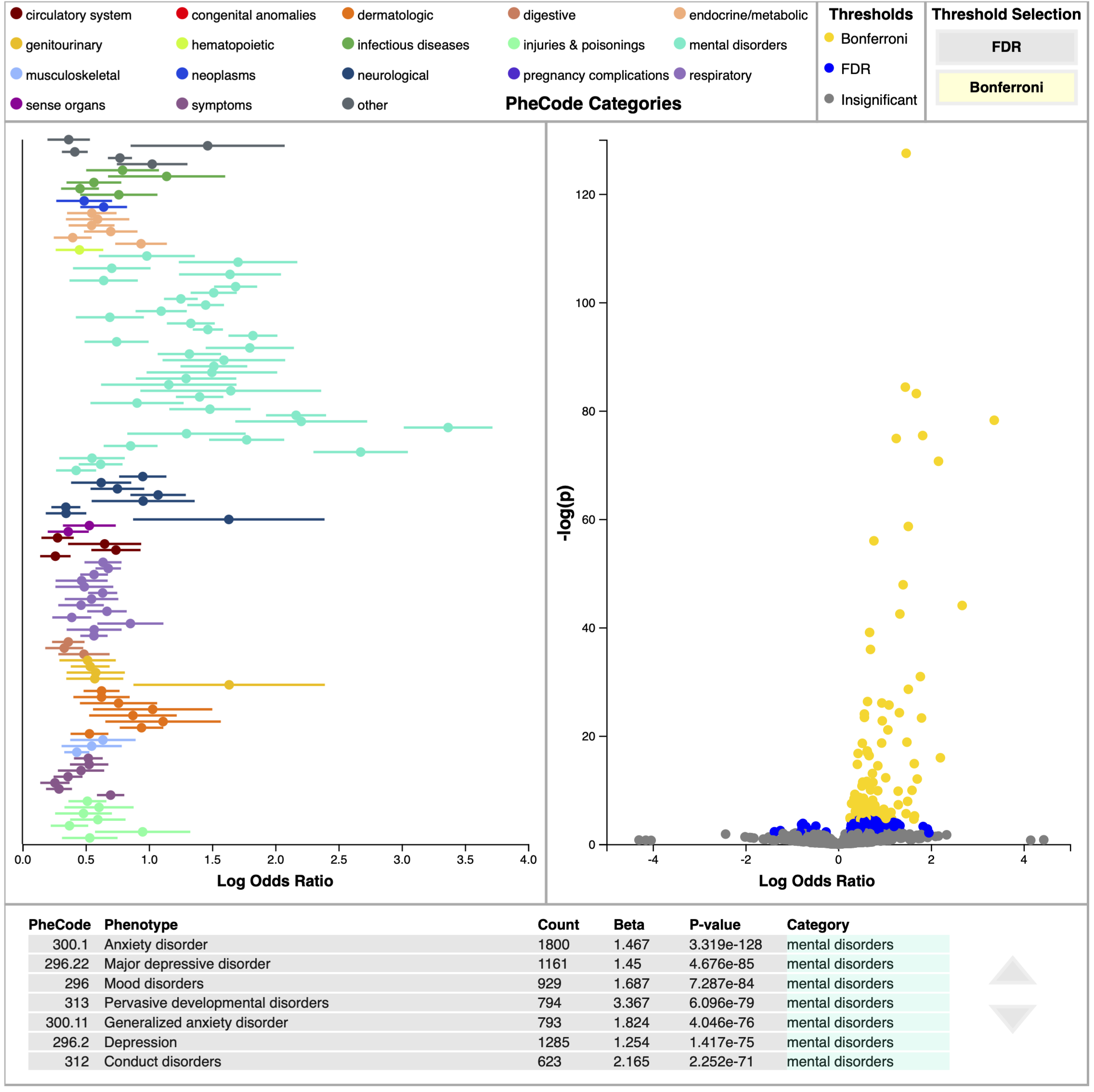
Log Odds Plot
The log odds plot shows the beta value (along with its confidence interval) on the x-axis with PheCodes listed down the y-axis. Only PheCodes that exceed a multiple comparisons correction significance level (either FDR or Bonferroni) are included in this plot. The user can switch between FDR and Bonferroni via clicking on the appropriately named button at the top of this panel. PheCodes are sorted into and colored by 18 unique categories. This plot is advantageous for comparing effect sizes of different PheCodes, at-a glance analysis of category prominence, and assessing sureness of fit for a PheCode based on confidence intervals.
Volcano Plot
The volcano plot shares the same x-axis as the log odds plot, but shows significance on the y-axis via the negative log of the p-value. The negative log is used instead of the raw p-value to emphasize significance; low p-values are more significant than high p-values, so when it’s transformed by the negative log, high values correspond to high significance. In this view, PheCodes are colored according to which multiple comparisons correction significance threshold they exceed (insignificant, FDR, and Bonferroni). This view is a useful summary of the model results and may be used as a starting point for deeper investigations, as users can see interesting Phecode relationships in a single glance (e.g. PheCodes with high effect and high significance).
Data Table
The data table explicitly lists the results of the logistic regression for each PheCode, including PheCode number and name, the count number of subjects in the cohort presenting that PheCode, beta value, p-value, and category. PheCodes are sorted according to ascending p-value, so that the most significant PheCodes are listed at the top of the table.
Interactions
To increase coherence among these views, several interactions are available to the user. Hovering over a PheCode on either the volcano or log odds plots displays the PheCode’s name. Clicking on a PheCode in either plot highlights the PheCode in both plots, pins the name of PheCode to the plot, and highlights the PheCode’s row in the table (if visible). Finally, selecting a PheCode from the data table highlights that PheCode in both plot views. Clicking on either plot’s background clears plot highlighting.